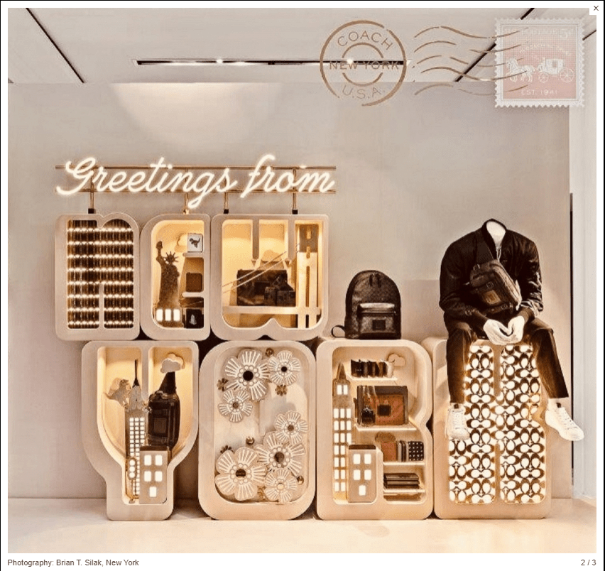
This window display by Coach in New York won the International Visual Competition last year according to VMSD. I really love this visual display because it utilizes many different design elements and principles of design. For example, Coach does a great job of using a neutral color scheme with colors that are very similar to each other and are very appealing to the eye. I think Coach used texture in the best way possible by putting different items within the letters of “New York” to make the display very 3D. It is very easy to read because they used the design element of line and direction. “Greetings from New York” flows from top left to bottom right, which is the direction that people read. The Coach “stamp” at the top right corner provides a sense of unity and harmony for the whole window display because it pulls the entire theme together. This display even provides a sense of tension and surprise by putting the mannequin in all black sitting on the ‘K’ of New York. It is unexpected but gives even more life to the visual effect of this great window piece by Coach.
https://www.vmsd.com/content/sensorial-playground-part-ii
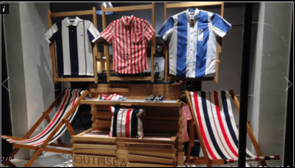
This window display by South Sea is absolutely not appealing to the eye. The different and opposing striped patterns on the chairs and shirts go against the rule of color scheme and texture. The shirts hanging also appear wrinkly and are not displayed well to make the customer want to purchase. The display does, however, have a little sense of symmetry with the two chairs on either side and three shirts hanging at the same height. It also has a good deal of contrast due to the neutral wood tones under the stripes. This visual merchandising has no sense of unity or harmony because of the loud patterns that overwhelm the eye.
