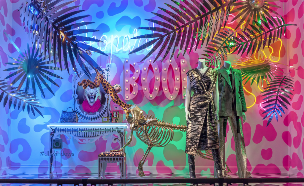
I personally really love this window display just for the bright color schemes and pops of patterns. The colors are eye-catching and usual but still make sense within the display. You can sense the different textures with the animal print, animal “skeletons”, and leaves. I think this display is still proportioned, however, without being too overbearing. The cheetah print underlying the whole display provides the principle of repetition and it makes an emphasis on the clothes that are not as brightly colored or patterned. The monkey hanging definitely adds an element of tension and surprise while everything is still cohesive.
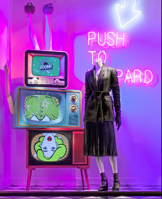
On the other hand, I do not care for this display. While it does have the same bright color scheme and elements of the last display, I believe this does not have a sense of unity or harmony or cohesiveness. You cannot read the saying behind the mannequin, which is probably what ties everything together. The TVs, to me, do not make sense being upside down and differentiating color schemes than the purple/blue hues behind them. The legs were suppose to add an element of surprise but I think instead, it distracts too much making the surrounding objects louder than the outfit at hand.
