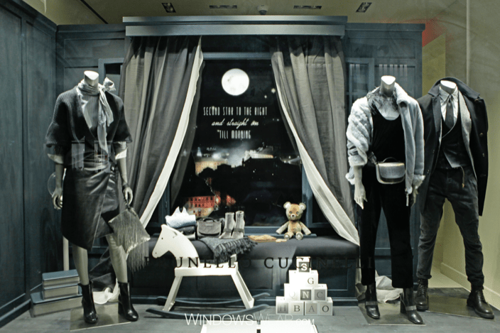
When I first look at this window display, my reaction is that it looks very clean and chic. The color scheme consists of blues and neutral tones making the observer feel relaxed and calm. It has an overall sense of unity and harmony including a “bedroom/Peter Pan” theme. The main focus is still on the mannequins and clothing but the eye is also drawn to the toys one would see in a child’s bedroom. There is a splash of color in the window with the visual of the house, adding an element of surprise to this display. The clothes look like a modern twist on items characters in the Peter Pan movie would wear. I think this display is overall so creative, unique and well put together.
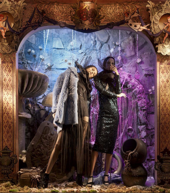
I think this window display was trying to accomplish the theme based off of The Little Mermaid’s ‘secret grotto’. However, the way the visual merchandisers went about it was very messy and displeasing to the eye. The color schemes should have gone well with each other but because the tint of each color were way too light, it is distracting and does not mesh well. There are too many random items everywhere providing a sense of chaos instead of unity. The mannequins positioning gives the element of tension but is more uncomfortable than surprising. The border of the whole window display is symmetrical which does not make sense with the rest of the display.

Great thought!! From Dr. song
LikeLike