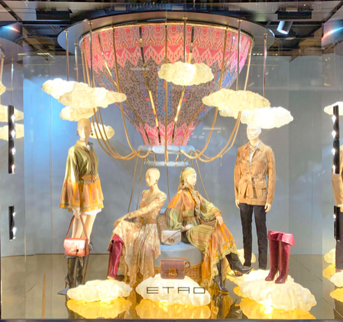
I really enjoy this particular window display because it tells a story. The clouds and the hot air balloon chandelier are so pretty and make the whole display look whimsical while adding some tension to it as well. The color scheme is very well put together with pink pops accenting the items that are supposed to catch the observer’s eye providing some contrast. The clouds and differentiating patterns add a lot of texture to the display. It appears very symmetrical with the mannequins standing and sitting mirroring each other. Repetition is utilized by the clouds scattered around the display. Overall, this display is well done and has a great sense of harmony.
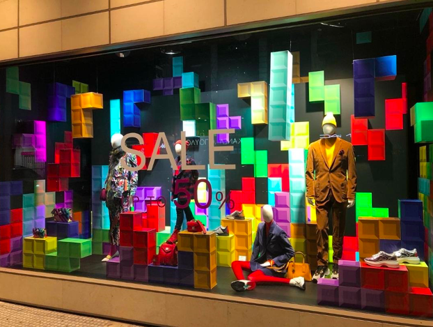
This window display just has way to much going on and is too over-stimulating to the eye. The bright colors and different textures overpower the mannequins with the clothes because there is a lack of contrast with the color scheme. The clothes do not really make sense to me with the given theme either. The only repetition are the Tetris blocks but there is no sense of direction. It is hard to tell what the emphasis is supposed to be in this window display. This display also makes it hard to read the sale sign and the percentage. There is no sense of unity or harmony within this display. This visual merchandising is way too busy and not effective for making customers want to purchase.
