
I love the overall “New York” feeling this window display gives. The color scheme immediately shouts rock-and-roll and then as you look closer it reiterates the theme. I do wish there was better lighting so the display caught the eye of passerbys a little more. The displayed outfits are brightly colored making sure that they are one of the main focal points overall. Repetition is achieved by the big, framed picture behind the mannequins with nearly the same photo on top and bottom. The frame itself gives a great texture to the display and really gives a sense of harmony, pulling the whole thing together. I think the real guitar on one of the mannequins gives the design element of surprise and tension to the window display.
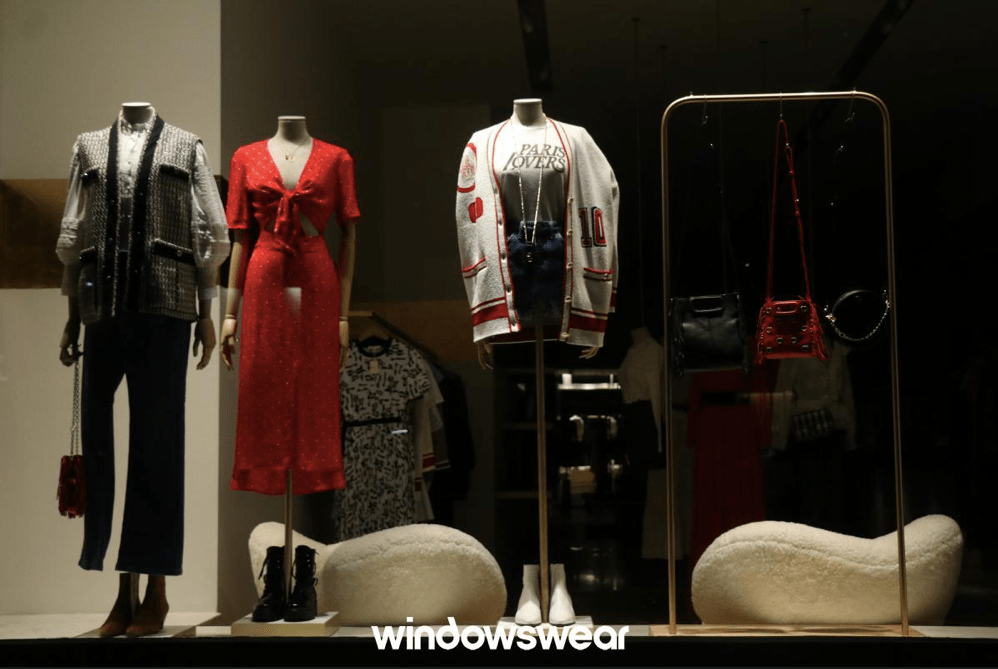
Although this window display has a similar color scheme to the display above. However, I do really like the three main outfits coordinating and playing off of each other. The display is confusing to me because it does not have a clear sense of repetition. The two chair items in the back seem like they are trying to create symmetry in the display but then the two mannequins to the left and then the mannequin in between the chairs are contradicting the symmetry. The rack of purses can hardly be seen due to lighting issues as well as the dark colors of the purses themselves. Overall, the window display is pretty boring to me and could have used some more decorations or lighting techniques or depth achieved with texture elements.
