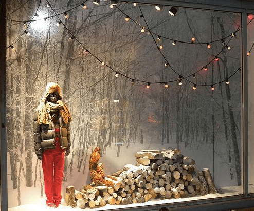
Considering what we learned this week about lighting effects, I chose a display where I thought they utilized lighting for mood very well. The lighting on the main focal point (the mannequin) really captures the observers attention and gives a precise direction to the display from left to right. I think the string lights also give the display a calming and peaceful vibe that the overall theme was trying to capture. The red pants on the mannequin give the display a sense of surprise and tension but the neutral tones throughout give it harmony and unity, all correlating with each other. The picture of the forrest as the background provide depth while still keeping the display simple.
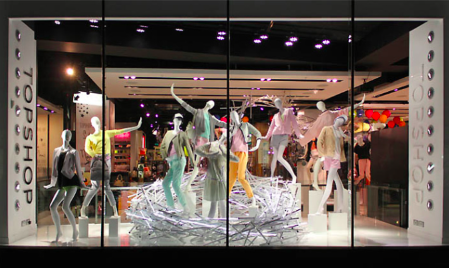
At first I thought this display was interesting but then I realized it is kind of stressful on the eye because of the misuse of lighting and focal points. There are just too many without a clear sense of direction or harmony. The lighting appears to be spotlighting every mannequin when I think they should have put pops of color on just a few mannequins and made them a focal point by putting the spotlight on only those. The color theme seems to be pastels but they almost disrupt each other by using too many. I do like the poses the mannequins are in because it provides a sense of tensions, however, the positioning and depth seems a bit off. I think they were on the right track with this display, they just needed a few tweaks to really make it effective.
