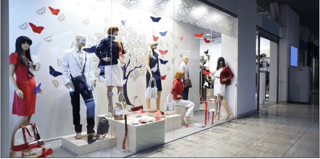
Since this week’s topic was about mannequins, I tried to find an example of a visual merchandising display that I believe utilized fixtures and mannequins well. I love this window display because I feel like all the mannequins are not only positioned well, but their outfits are perfectly coordinated and really up-sells the brand. This display is very symmetrical without being too predictable. The butterflies and pedestals that some mannequins are displayed on provides a great texture. I really like that the color scheme of red, dark blue and white almost gives the observer direction from left to right. There is a clear focal point in the middle and the tree being focussed on almost gives the display an element of surprise as well. I think this display is very elegant and edgy and really utilized elements of design well.
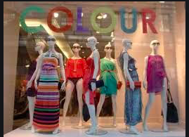
This week, the lessons were all about mannequins so I thought I would observe how some brands utilized them in their visual merchandising displays. This, I believe is a very bad example of positioning the mannequins. There is no clear focal point or direction of the display and because of this, not very appealing to the eye. While the color scheme is way to loud and all over the spectrum, the title “Colour” above the mannequins, makes me believe that this was intentional so it does not bother me that much. I also think the rhythm of the display is poor because they put a mannequin with a long dress in front of a mannequin that has a swimsuit bottom on. To me, this texture and rhythm does not make sense. The display also lacks an element of surprise and tension since all the mannequins are wearing bold and opposing colors. There is no clear cohesion to this display.
